If you’ve ever had issues picking a paint color, I can totally relate! We decided to paint our room a neural gray color. He wanted gray; I wanted a warm, neutral backdrop for future furnishings and decorating. How hard could this be? Famous. Last. Words.
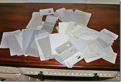
Finally after researching all the gray rooms in blog land, the articles, the pictures, etc. I settled on six samples to try. I highly, highly, highly recommend getting the samples. Best $3 ever spent. Or $18. Whatever. It was so worth it, because the actual paint color looks very different when it’s on a great big wall.

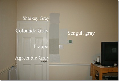
Here is what I sampled:
Sharkey Gray – Martha Stewart (Home Depot)
Frappe – Valspar (Lowe’s)
Collonade Gray – Sherwin Williams
Agreeable Gray – Sherwin Williams
Seagull Gray - Lowe’s Seaside Retreat collection
Silver Sateen – Behr (Home Depot)
We had Home Depot color match what wasn’t theirs ‘cause we knew we wanted to use Behr paint. Best paint ever, in my opinion.
Right off the bat, I felt Silver Sateen was too blue, so it’s not in any pictures. Sorry!
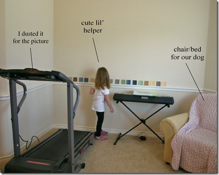
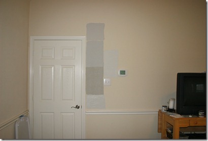
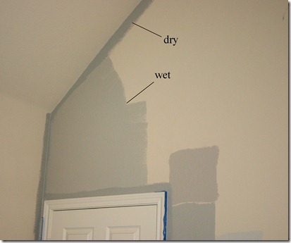
So the process begins...by the way, paint a large enough area with your sample paint so you can see how it will look. I painted small areas at first and it was no help. Paint areas at least this big:

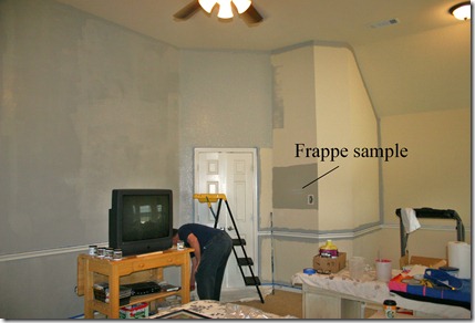
I’ll be honest. I wanted Frappe from the get go. Looking at the card, the color was gorgeous. Perfect. But having all the samples on the wall made be consider other options, which is a good thing.
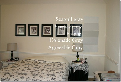
My first thoughts:
My first thoughts:
Seagull gray – very pretty light gray, but not much of a change
Sharkey gray – more pink in it than what you’d think
Frappe – my favorite, though seeing it all the wall I definitely saw undertones of green
Collonade Gray – pretty, maybe too blue?
Agreeable Gray – a nice light gray, maybe not enough of a change and if we going through the trouble of painting, we wanted a big difference
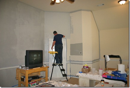
I stared at these walls for days. I fell asleep staring at these walls. I tried to envision the entire room painted one of these colors. I contemplated how I would decorate with each one. I thought about how they’d look with the ceiling color, the carpet, the adjoining bathroom walls (painted Forest Lichen, Martha Stewart). I asked for opinions from friends and family. I drove hubby nuts with my indecision.
So what did I choose?
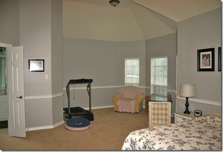
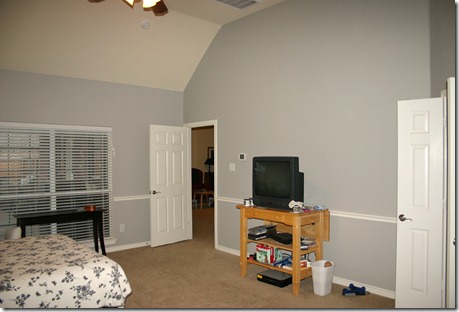
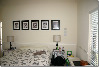
I chose Collonade Gray, and in the end here’s what sold me: The Collonade Gray swatch PERFECTLY matches the London Fog swatch by Benjamin Moore, and I found a beautiful room painted in London Fog by Dear Lillie that I loved. Just the right amount of brown undertones for a beautiful neutral gray.
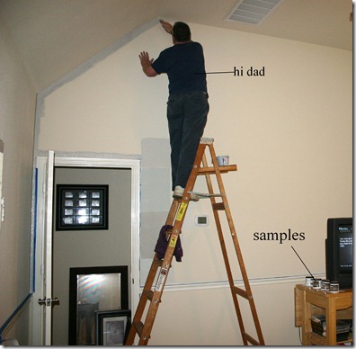
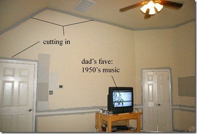
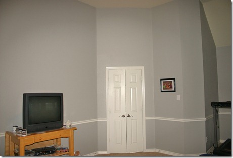
The entire wall (below) is painted, but check out the various shades of color as it dries. Most dry is on the left:

Yep, it’s a room of hodge podge furniture, but a fresh coat of paint certainly puts me in the mood to change that. New furniture and decorating is next. Stay tuned!
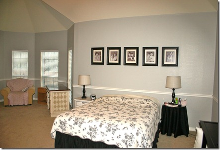
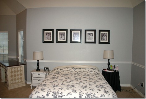
One last look…
This color totally warms up the room and we couldn’t be happier. Now on to decorating … if you have ideas of how to decorate this room, I’d LOVE to hear it.
Linking to:


No comments:
Post a Comment